
Let’s be honest: cloud invoices are terrible storytellers. They show you a giant number at the bottom and leave you to guess what happened.
“You spent 100k this quarter.” Great. But who spent it? Why did they spend it? And was it worth it?
A FinOps dashboard answers those questions instantly.
It tells you, “Engineering launched three new features, storage grew 18%, and the additional cost had positive ROI.” Suddenly, you’re not reacting to a scary number you’re managing with clarity. That shift, from raw cost to meaningful insight, is where FinOps becomes powerful.
Why Metrics Matter More Than the Bill
Every organisation starts with the same instinct:
Track the total cloud cost. It feels logical, until you realise it explains nothing. Total spend doesn’t tell you whether a spike happened because the business grew, or because someone forgot to turn off a test cluster on Friday night.
It doesn’t reveal whether a feature is profitable or expensive. It doesn’t show whether your commitments are paying off or being wasted.
Good FinOps metrics make cloud spend make sense.
They help teams understand who spent the money, what created the cost, and whether the outcome was worth it. Once that clarity arrives, conversations between finance, tech, and product become many times easier and much more productive.
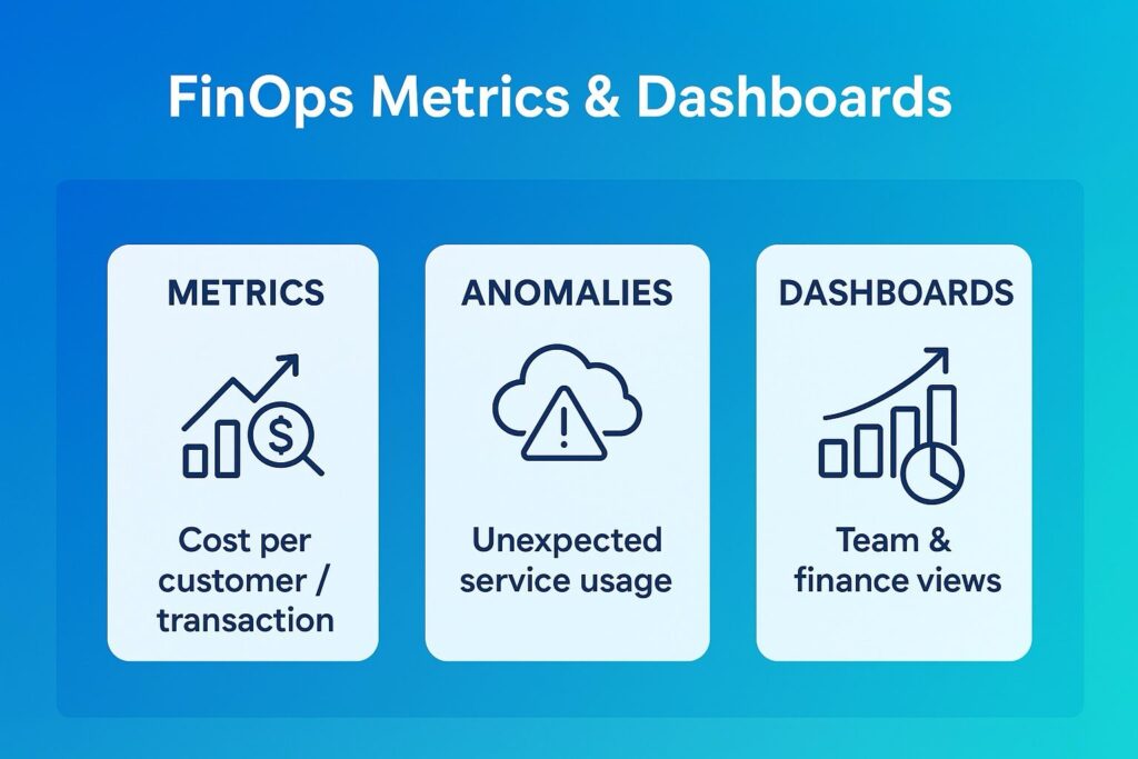
The KPIs That Actually Matter
Some KPIs sound impressive but don’t move the needle. The real value lies in metrics that connect cloud usage to business outcomes. For example, cost per customer or cost per transaction immediately tells you whether you’re scaling efficiently.
When you can say, “Each API call costs 0.02 let’s target 0.015,” you suddenly have a meaningful performance lever.
Commitment coverage is another big one.
If 60–70% of your predictable workloads are covered under Reserved Instances or Savings Plans, you’re operating at a healthy discount.
If you’re at 20%, you need to recheck
Then there’s cost per feature. This one opens everyone’s eyes.
Imagine showing product managers exactly what it costs to run a feature every quarter and whether its adoption justifies that spend. That’s when value becomes a shared responsibility.
Unit economics takes that even deeper by normalising cost across workloads.
Cost per VM hour, per GB stored, per API call these are the comparisons that cut through noise and guide decisions. And of course, anomaly rate tells you how often your cloud behaves unexpectedly. Fewer surprises mean better forecasting, better governance, and a happier CFO.
Anomaly Detection The Cloud Smoke Alarm
Think of anomaly detection as your early warning system. It won’t prevent every issue, but it will save you from unpleasant surprises.
Most anomalies are simple:
A batch job loops infinitely, autoscaling goes wild, someone spins up GPUs without telling anyone, or tagging breaks and spend dumps into the “unallocated” bucket.
When your system flags a 20% spike within hours not weeks it changes everything.
You fix the issue before it snowballs. You avoid budget panic. And most importantly, you reinforce the culture of ownership that FinOps thrives on.
Daily alerts, sensible thresholds, and clear owners make anomalies manageable instead of stressful.
What Dashboards Should Actually Do
- Dashboards aren’t about pretty colours and charts.
- They’re about providing the right people with the right insights so decisions improve.
Leadership needs a big-picture view:
- How are we trending? Are commitments paying off? Are we within budget? What’s driving costs this quarter?
Engineering needs something completely different:
- Which services are spiking? Where is waste hiding? What should we be rightsizing next? How does non-prod compare to prod?
Finance needs its own version too:
- How do we allocate spend across teams? Who’s exceeding forecasts? Which workloads cost the most per unit? Dashboards are really just conversation starters each one tailored for the audience looking at it.
And the best part?
They live where teams already work: PowerBI, Grafana, Datadog… anywhere but a forgotten finance folder.
The Pitfalls Almost Everyone Falls Into. The biggest mistake teams make is obsessing over vanity metrics.
Total spend goes up? Panic.
Total spend goes down? Celebration.
But neither says anything meaningful without context. Another common issue is dashboard overload. Every team builds its own version, none of them align, and suddenly you have 14 dashboards and zero clarity. Monthly reporting is another killer. Cloud spend changes daily. If you’re only looking at it at the end of the month, you’re essentially flying blind.
And then there’s the classic:
Dashboards with no owners. No accountability. Just visuals.
FinOps only works when someone actually takes responsibility for the numbers. Turning Invoices into Insights
A cloud bill tells you what you spent. A FinOps dashboard tells you whether it mattered. And that’s the heart of this practice. When your metrics connect spend to business value, when anomalies are caught early instead of at month end, and when dashboards become part of everyday conversations… cloud cost transforms from a headache into a strategic advantage.
This is how FinOps turns invoices into insights and insights into impact.
#FinOps #CloudCostOptimization #CloudFinance #CloudManagement #DigitalTransformation #CloudArchitecture #UnitEconomics #CloudGovernance #EngineeringLeadership #TechStrategy #AniketWrites #CloudValue